
Form Fields
Form fields are the building blocks of your form. They determine the type of data that will be collected from your applicants and how it will be displayed on the application form.
There are several types of form fields available, each with its own unique properties and functionality.
Configuration Options
Each form field comes with a set of configuration options that allow you to customise its appearance and behaviour. These options include:
Label
The label is the text that appears above the field when it is displayed on the form.
Placeholder
The placeholder is the text that appears inside the field when it is empty.
Help Message
Additional information that appears below the field.
Required
Determines whether the field is mandatory or optional.
Default Value
A starting value the field is pre-filled with, so the applicant sees it already there instead of a blank field. Available on Text Input, Number Input, Date Input, Radio Buttons, Horizontal Radio, Checkboxes, and the Application Identifier types (ABN, EIN, Charity Number). Not available on File Upload, Multi Column Input, List Input, Expenses Input, Financial Grid, Major Donor Grid, Section, or a repeatable field.
If a field is instead set to pull its value automatically from a document or another field, the default value option is hidden — the automatic source fills it instead, and the two cannot both apply.
Validation Rules
Validation rules define the criteria the field's input must meet to be valid. One built-in rule, available on the plain Text Input type, requires the answer to look like an email address. It is not offered on other text-like fields such as Number Input or the Application Identifier types.
Condition
Conditions decide whether a field is shown or hidden based on the answers to other fields. See the section below for what a condition can and cannot say.
Hidden
Specifies whether the field is displayed or hidden.
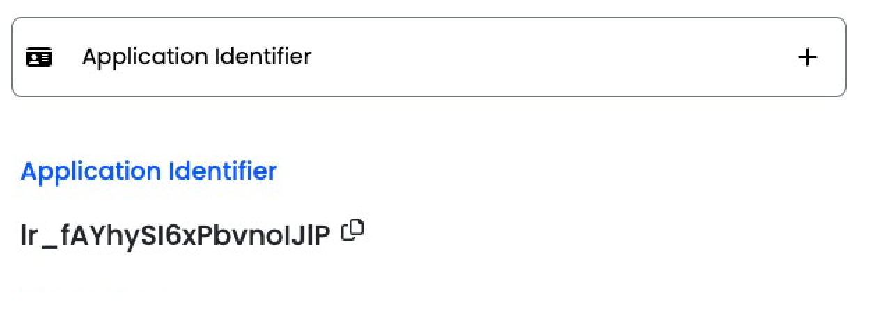
Application Identifier
A unique identifier assigned to each application.
Field Types
Available field types include: Heading, Paragraph, Email, Application Title, Text Input, Rich Text Editor, Number Input, Date Input, File Upload, Expenses Input, Multi Column Input, List Input, Select Any One (Radio Buttons), Select All That Apply (Checkboxes), Horizontal Radio, Page Breaker, Section, Financial Grid, and Major Donor Grid.
Section groups related questions into a titled block that can be shown or hidden as one. Financial Grid and Major Donor Grid collect figures across several years, working their year columns out from the applicant's financial year end and founding date. See The Financial Grid Field.
How conditions work
Three things about conditions are worth knowing before you build a form around them.
Six operators, and no more
You can compare an answer using is, is not, greater than, less than, greater than or equal to, and less than or equal to. There is no "contains" and no "is empty", so a question you intend to branch on is best asked in a form that these operators can test.
Two levels of grouping
Conditions sit in groups. Within a group they join one way, all or any, and the groups join the other way. You cannot nest a group inside a group.
Hidden answers are discarded
This one surprises people. When a field is hidden by a condition:
It is not required, so a hidden mandatory field will not block submission.
Its answer is not saved. If an applicant answers a question and a later answer hides it, what they typed is dropped rather than kept quietly in the background.
Related: be careful deleting a field that other conditions point at. Those conditions are then treated as satisfied, and whatever they were hiding becomes visible to everyone, with no warning.
Pages can carry conditions too, with one extra rule: a page can only be hidden based on answers from earlier pages. See Sections and Conditional Questions.